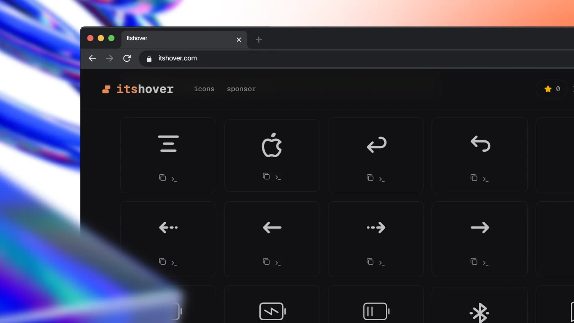
Animated icons that move with intent.
Open-source animated icons with motion baked into editable React components. What it does: Its Hover provides a growing library of open-source animated icons designed for modern web interfaces. These icons are built as editable React components, allowing for seamless integration and customization within your projects. The motion-first approach ensures that animations are a core feature, not just decorative elements, enhancing user experience and interface engagement. Key features: • Open Source — Fully editable and community-owned React components for maximum flexibility and collaboration. • Customizable — Easily modify and adapt icons to fit your specific design system and branding needs. • Motion-First Icons — SVG icons designed with intentional animation as a primary feature, adding dynamic flair. • Seamless Integration — Works effortlessly with popular frameworks like Next.js and design systems such as shadcn. • Community Supported — Backed by the Vercel Open Source Program for robust infrastructure, ensuring speed, reliability, and accessibility. Use cases: • Enhancing user interfaces with dynamic and engaging micro-interactions. • Creating visually appealing onboarding flows and tutorials. • Adding personality and polish to buttons, navigation elements, and status indicators. What makes it different: Unlike static icon sets, Its Hover focuses on intentional motion as a fundamental aspect of each icon. The open-source nature and editable React components offer a level of customization and integration depth not found in traditional icon libraries.